Office Depot & Viking
Design Language & UX Design
A new design concept was created, taking inspiration from the existing Viking Direct site but taking the design in a new, more modern, direction..
Designed mobile-first but without compromise regardless of desktop or mobile device, so the user experience is great in either case.
Office Depot & Viking
UX/UI Design & Prototype
Careful consideration was given to the design but also use of unique push notifications for a better customer experience.
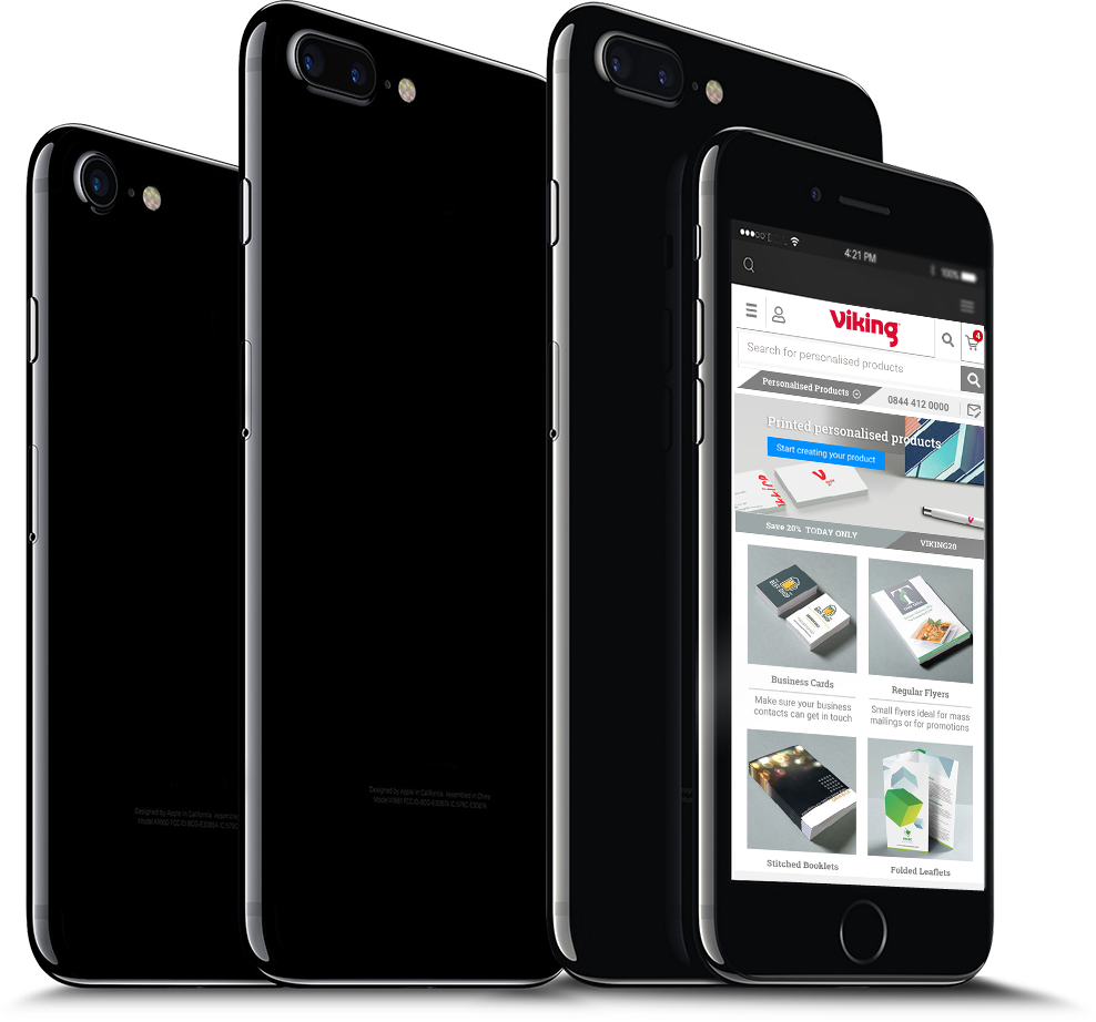
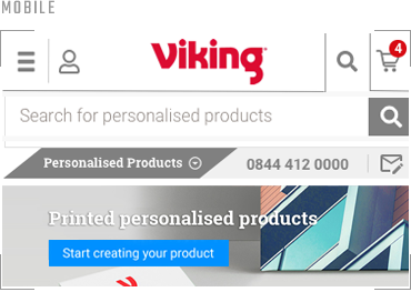
Mobile Compatible
Responsive Mobile View
The design is intended to be intuitive to customers who are browsing for promotional products on mobile devices with elements such as search and contact prominent when required and with a UI that is consistent regardless of whether the site is accessed via a desktop or mobile device.
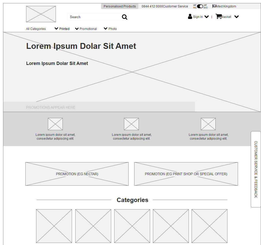
PLANNING THE USER EXPERIENCE
Wireframes
Interactive wireframes were created for the entire site, enabling ease of user testing and disussion with stakeholders throughout the process.
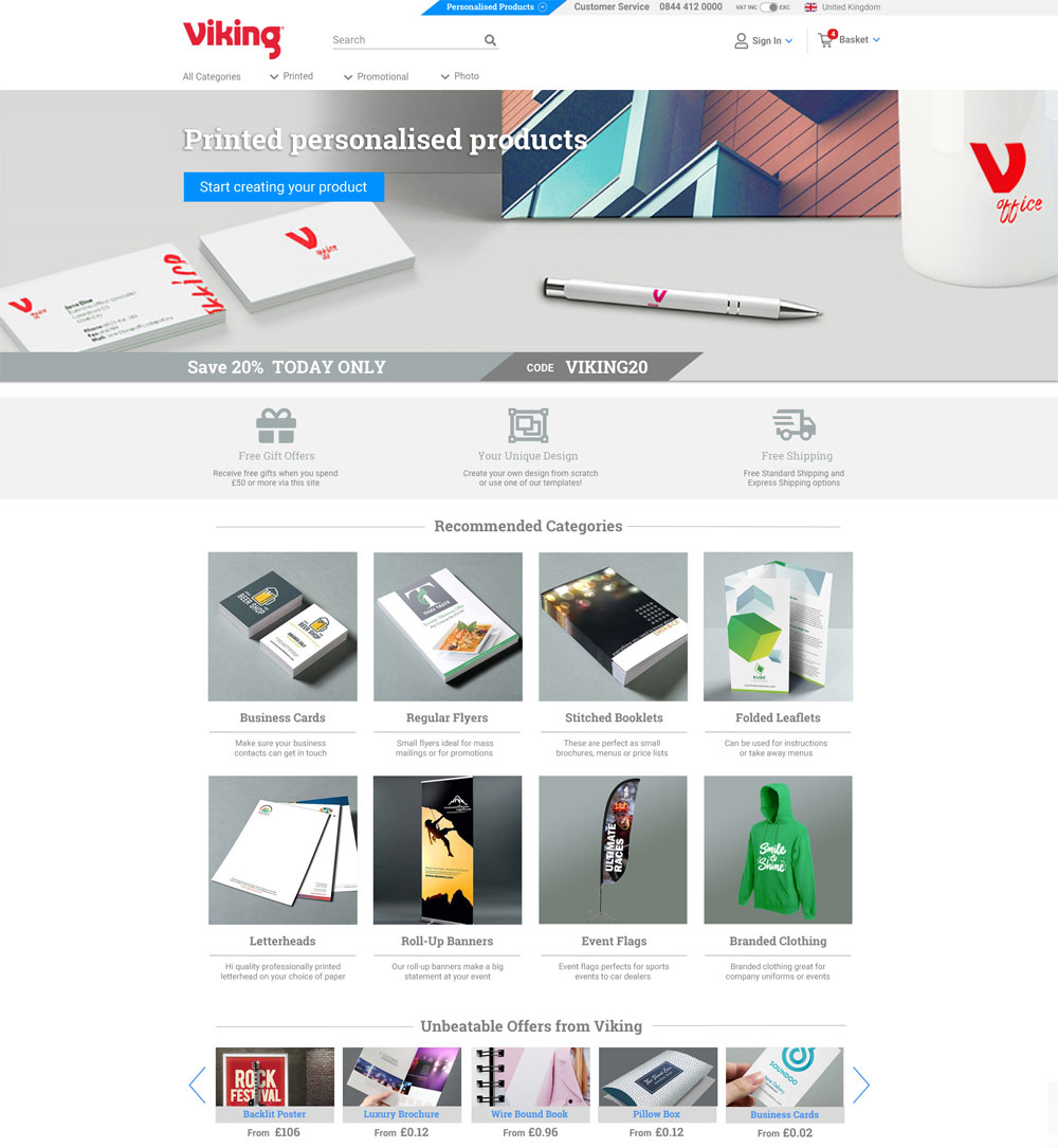
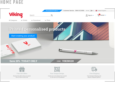
HOME PAGE DESIGN
Fully Responsive Design
User experience was at the heart of the design process. Each element on the page was carefully considered, from the navigation (minimised to bare essentials to help focus end users) to VAT being controlled via a switch, all based on user research and user testing through the process and also using tried and tested methods and best practice (using research available from online resources).
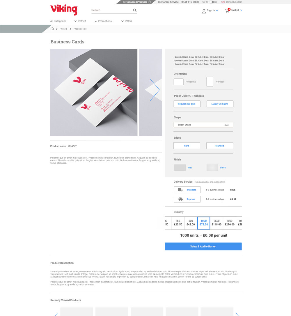
PDP | Product Detail PAGE
Design Details
Over 100 page examples and variations were designed in sketch (in both desktop and mobile format), to scale, ready for development. This is an example of another page created to show the product detail page. In this example, the image is sticky while the attributes to the right scroll, then the rest of the page content scrolls together. This ensures the design is both intuitive and elegant to use. The design also uses left-right scrolling for images for a neat, clean design (rather than the tradiitional thumbnails). This has both aesthetic and UX advantages when accessing the site with touch devices; it means interaction with images is consistent regardless of desktop or mobile device.