Phase One
Concept, Branding & Website
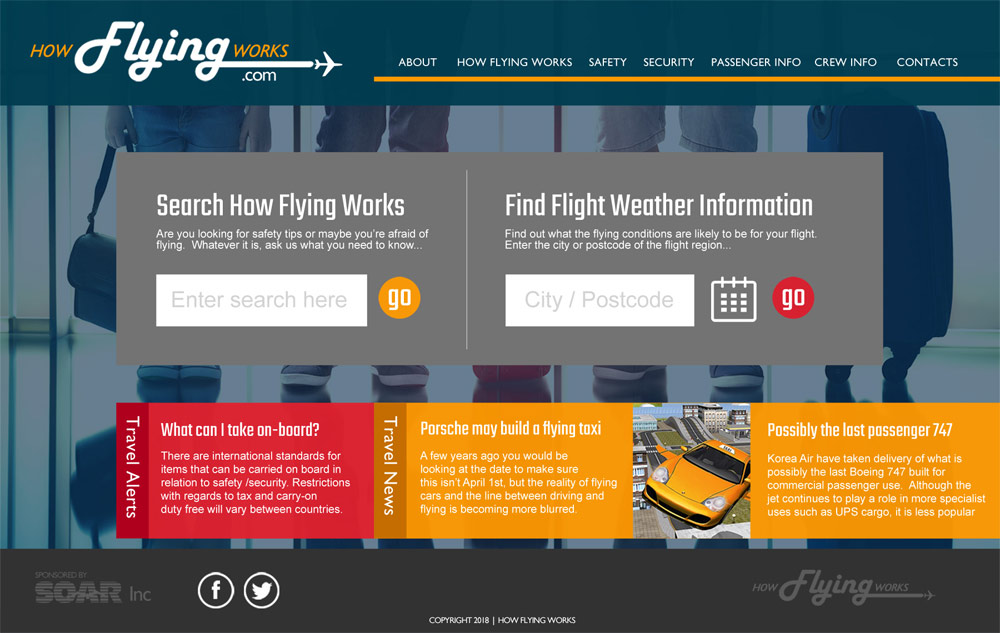
In creating the concept for "How Flying Works", I considered the various audience groups from frequent business travellers to occasional fliers. Some of these people would be looking for day to day information such as airport closures as well as rules regarding luggage etc. Other passengers would be fearful fliers looking for information to reassure them. Having worked on a project dedicated to fearful fliers, I used this experience as well as research of other aviation websites and resources.
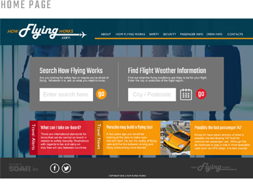
With this background information and research I created various branding ideas and arrived at the branding shown below. This includes a background showing a family travelling (so with universal appeal) combined with a business-like appearance to the website. The logo uses a traditional font to give the impression of jet trails, also with universal appeal...

PHASE TWO
UX/UI Design & Prototype
This project is currently in-progress, with user research, information architecture and user experience design central to the design process.
Equally important as the design and information architecture is the usability and accessibility of any website
Considering factors such as colour, contrast and the human factor is crucial in my design work.
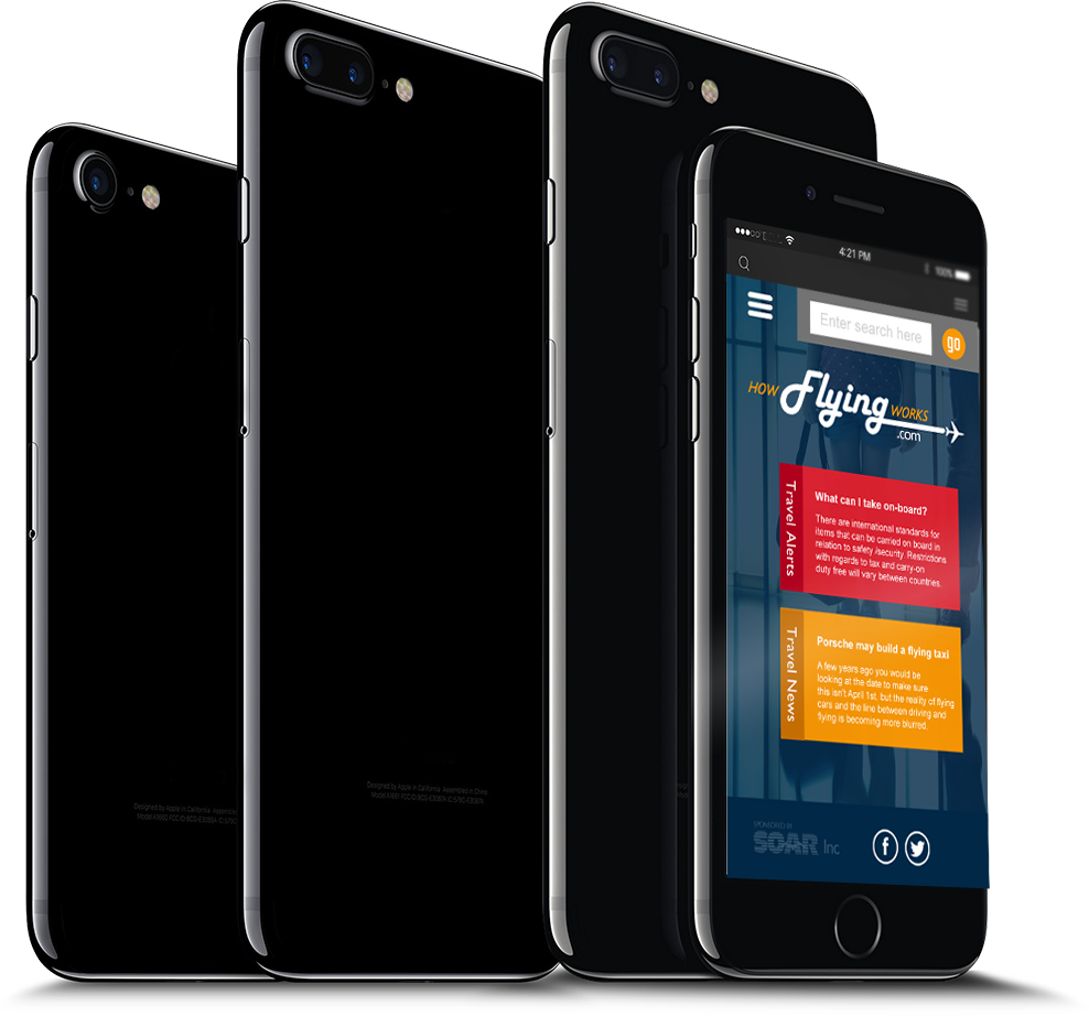
Mobile Compatible
Responsive Mobile View
Any modern website must be mobile compatible and easy to use, but even more so if the content is designed to be used on-the-move. How Flying Works is intended to provide information and reassurance to the travelling public so invariably will be used on-the-move. This website has been designed to be fully-responsive and adpats fluidly to the user interface.
Examples of work for this project
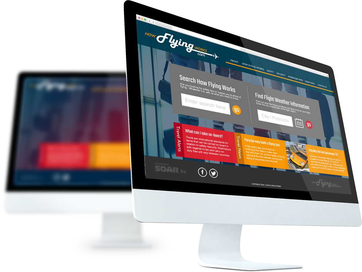
Desktop View
Screen shot of this case study shows the proposed home page concept.